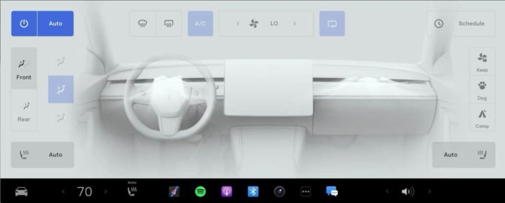
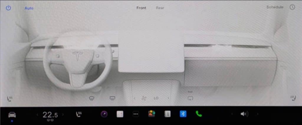
- 🚘 Tesla’s new, redesigned Climate Menu has been revealed.
- 🔄 The update includes a streamlined Climate Control panel.
- 📞 New feature reduces fan noise during phone calls.
- 🤔 Some users found old settings difficult to adjust.
- 👁 New design aims for minimalism and ease of use.
- 📉 New icons are subdued for better in-drive adjustments.
Tesla continues to lead the charge in automotive innovation by consistently updating its vehicle software, making the driving experience smoother and more efficient. The latest buzz surrounds their new, redesigned Climate Menu, officially revealed with Tesla’s recent software update. This blog post delves into the exciting new features, user feedback, and overall impact on Tesla’s streamlined approach to vehicle interiors.
Overview of the Redesigned Climate Menu
Tesla’s new Climate Menu brings a refined, minimalist design to one of the car’s essential features. The update was spurred by user feedback and aims to make climate adjustments easier and more intuitive.
Key Changes in the New Climate Menu
- Streamlined Climate Control Panel: The new layout is less crowded and designed to be more user-friendly. It provides easier access to temperature and airflow adjustments.
- Subdued Icons: The new icons are designed to be less flashy, reducing in-drive distractions while still being clear and functional.
- Noise-Reducing Feature: A significant addition to this update is the feature that calms the fan level during phone calls, ensuring a quieter atmosphere.


User Feedback: Pros and Cons
User experience is at the heart of Tesla’s continuous improvements. While the updates have been warmly received by many, there are a few mixed reactions worth noting.
Positive Feedback
- Minimalist Design: Many Tesla owners appreciate the new, more minimalist look. It aligns well with Tesla’s overall aesthetic and simplifies the user interface.
- Reduced Noise During Calls: The noise reduction feature for phone calls has been highlighted as particularly beneficial, enhancing communication clarity on the go.
Areas of Criticism
- Learning Curve: Some users found the switch from the old design to the new one a bit challenging, as they were accustomed to the previous layout.
- Button Size: A few users prefer the larger, bolder buttons of the old design, which they found easier to use without diverting too much attention from the road.
The Philosophy Behind Tesla’s Design Choices
Tesla’s commitment to simplification and efficiency is evident in this update. Just as they’ve simplified vehicle interiors in recent models like the Model 3 Highland and the Cybertruck, the new Climate Menu reflects an ongoing effort to make things as intuitive and seamless as possible for drivers.
Minimalism and Functionality
Minimalism isn’t just an aesthetic choice for Tesla; it’s a functional one. By reducing the number of elements on-screen, drivers can focus more on driving and less on navigating through a sea of options. This update shows Tesla’s dedication to marrying form and function in their vehicle designs.
Conclusion
Tesla’s new Climate Menu is a testament to their dedication to continuous improvement and user satisfaction. While the changes may take some getting used to for a few, the streamlined design, noise reduction during calls, and overall minimalistic approach create a more enjoyable and safer driving experience.
For those interested in the nitty-gritty details of software updates and design improvements, Tesla’s methodology presents a fascinating case study in user-centered innovation.


