With the release of Tesla’s new Model S Plaid, the automaker has designed a brand new user interface, and we take a first look at it in this article.
In many ways, Tesla is more of a technology company than an automaker, and that puts them at an advantage over traditional automakers when it comes to software.
It becomes super apparent when looking at the user interface.
Most automakers have struggled to develop smooth user interfaces. Many of them are now turning to Apple Carplay and Android Auto to satisfy younger customers who are used to the smooth experience of using smartphones and iPads.
With over-the-air software updates allowing regular improvements to the user interface, Tesla has now managed to build a significant lead when it comes to UI on screens inside cars.
Tesla’s UI has improved a lot over the last decade. Here’s a quick look at some of the main Model S UI generations:
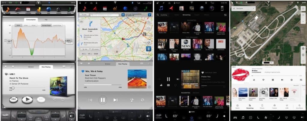
Now, with the new Model S Plaid introducing a brand new screen configuration in the electric sedan, Tesla has made one of the biggest updates to its user interface to date.
Shiv Sikand, founder of Drako Motors, took delivery of one of the first 25 Model S Plaids at the delivery event yesterday and he was kind enough to take some footage of the new user interface to share with us:
Tesla has now fully transitioned to a horizontal screen for the main display, like in Model 3 and Model Y, but the UI has to be different since the whole left part (right part in right-hand drive cars) is dedicated to the instrument cluster in the two less expensive Tesla models.
In the new Model S, Tesla has retained a separate screen for the instrument cluster, which gives them a lot more freedom for the UI of the main display.
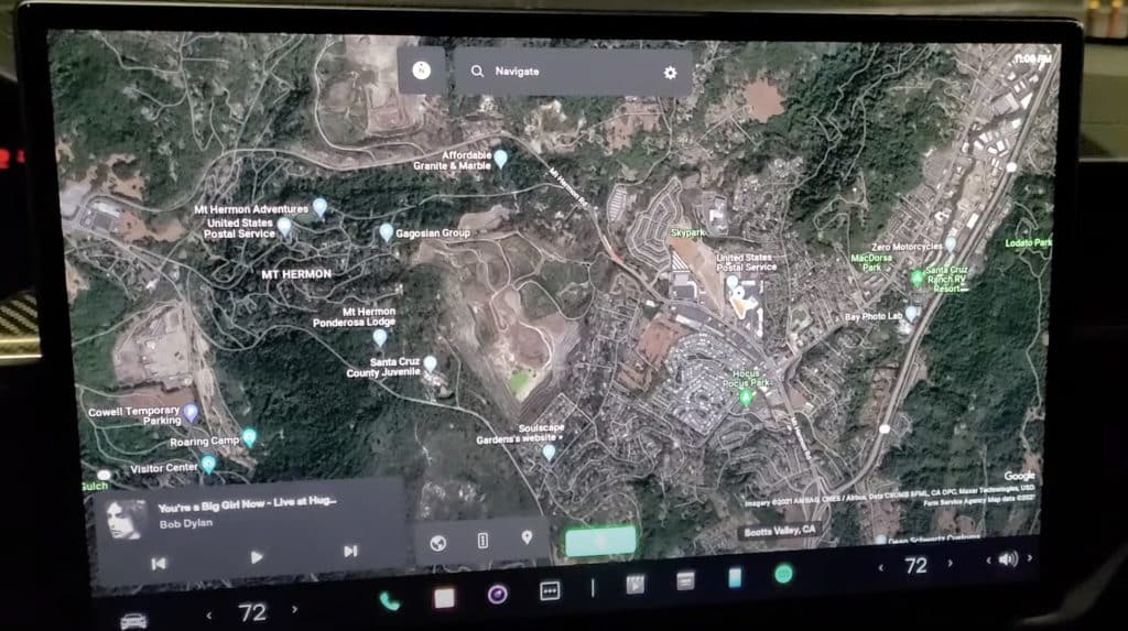
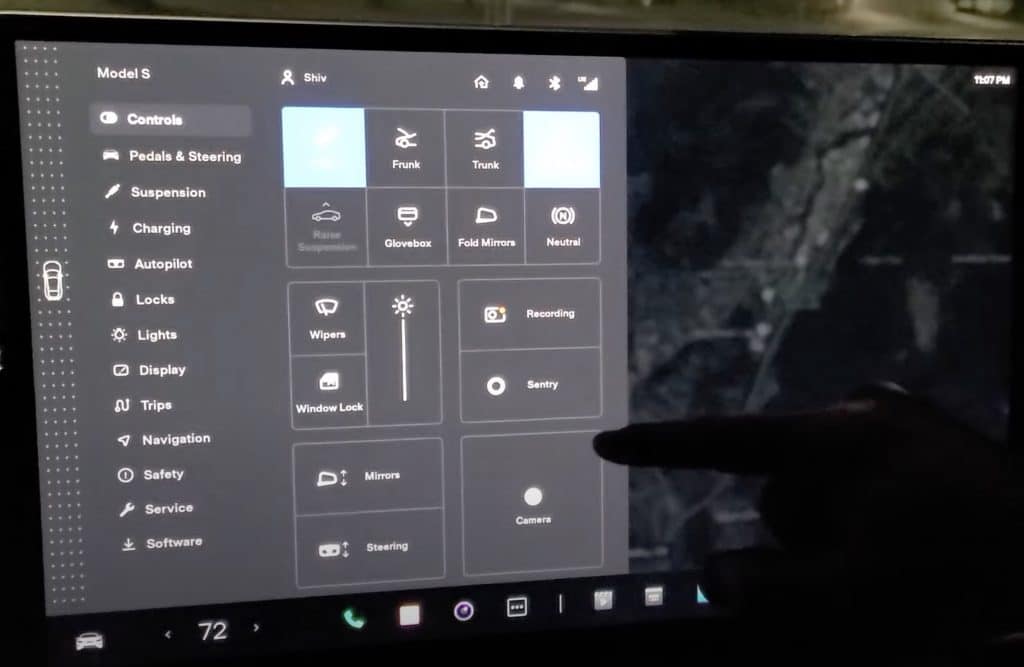
As you can see from the video above, the new UI features a completely redesigned controls window and app launcher as the automaker keeps introducing more features.
By default, you have the navigation app that covers the entire screen:
With this new update, Tesla owners can now move other apps, like the music app, not only up and down but also left and right for more optimal access to the settings.
The new control panel features large icon to access some of the most used features:
Also, on the far left side closest to the driver, you can see a dotted band that runs the entire screen. That’s in some way Tesla’s new shifter.
As previously reported, the automaker is now hoping that drivers will rely more on its ‘auto shift’ feature that uses Autopilot to determine on which driving mode (Drive, Reverse, or Park) the vehicle should be on, but a quick swipe up or down on that band will also change it from drive to reverse.
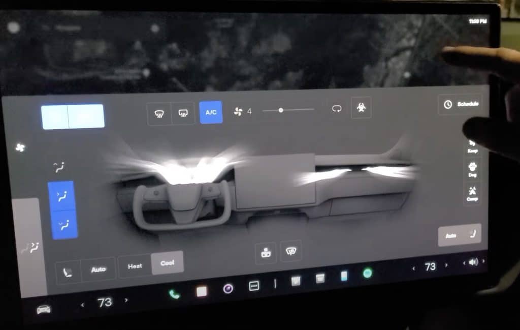
The new Model S also comes with Tesla’s new invisible A/C system integrated into the dash first introduced in Model 3, which means that it also has the same cool controls:
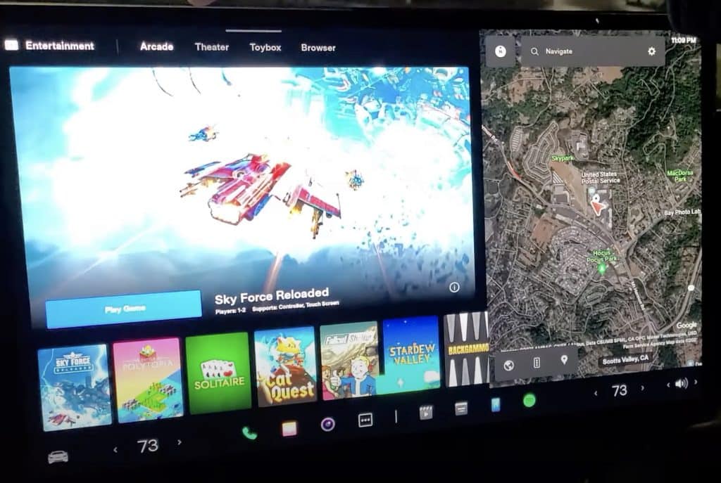
These settings are also accessible through the second-row screen, which also has access to all the entertainment features, which is a big part of the interior update to the Model S with the new PS5-level gaming computer inside the vehicle.
The Arcade and Theater apps are the same as the previous version:
With the update, Tesla has also updated the UI of the instrument cluster in the new Model S.
It’s not a massive update, but it makes better use of the screen, which is so easily visible thanks to the yoke steering wheel:
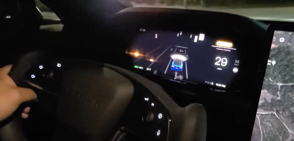
As you can see, the driving visualizations for Autopilot and the Full Self-Driving package now take up a lot more space on the screen.
It fills almost the entire screen, except for the right side, which displays your speed.
We expect that Tesla will keep improving the new user interface in the coming months leading to the anticipated release of its v11 software since this update is still under the v10 version.